Sun Hospitality Group had been a big name in premier destinations in Vietnam for a few years when they approached QUO with plans to develop a resort for the Curio Collection by Hilton.
They needed a full A-to-Z brand concept and execution for this resort, which will be the first Curio Collection property in Vietnam and the anchor property within Sun Premier Village Primavera, a coastal tourist destination.
Services
Brand culture
Logo and visual identity
Naming and tone of voice
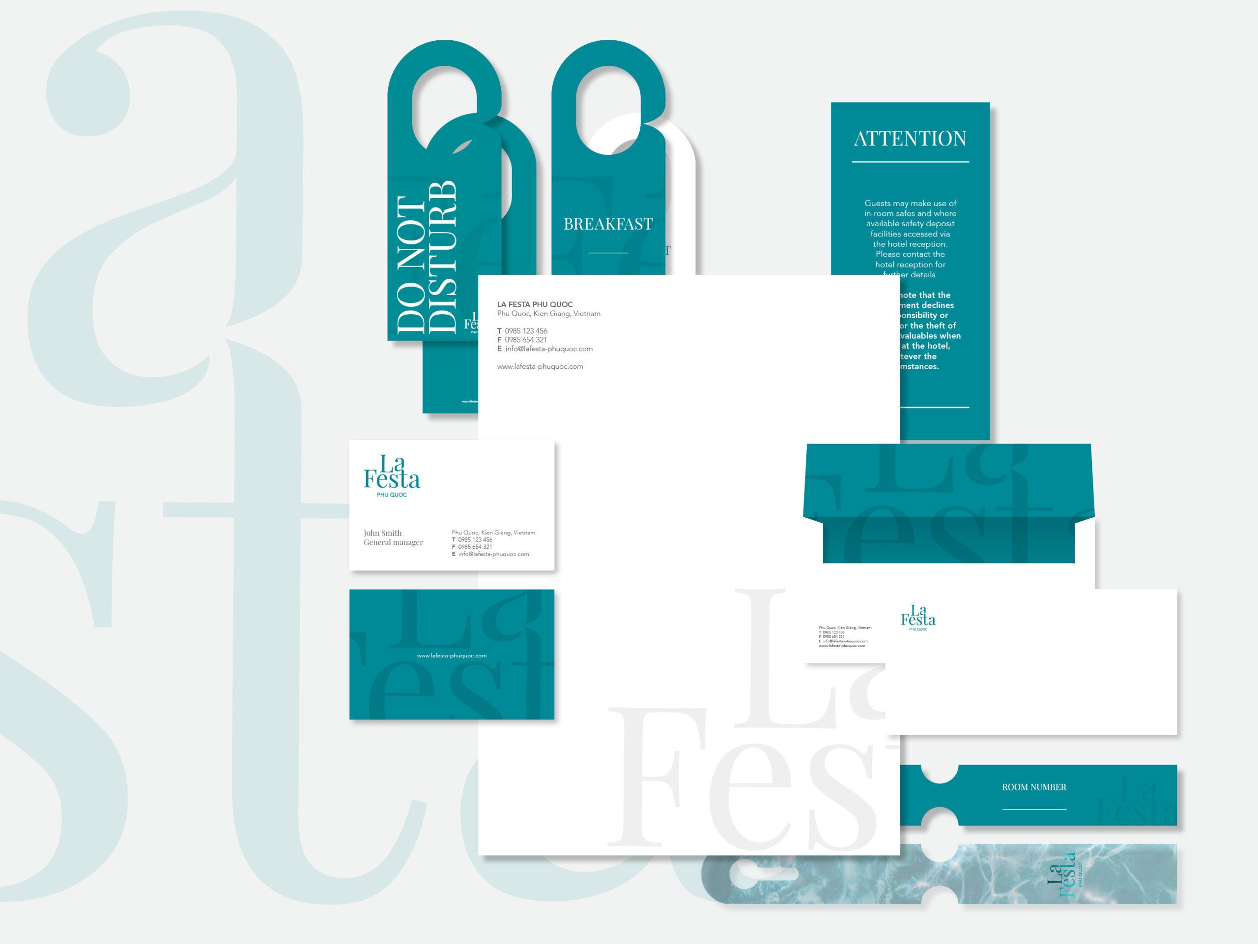
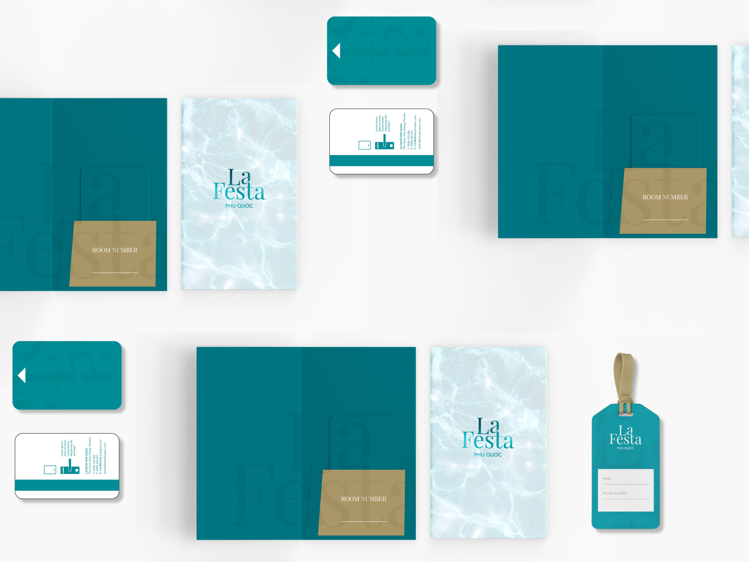
Hotel collateral
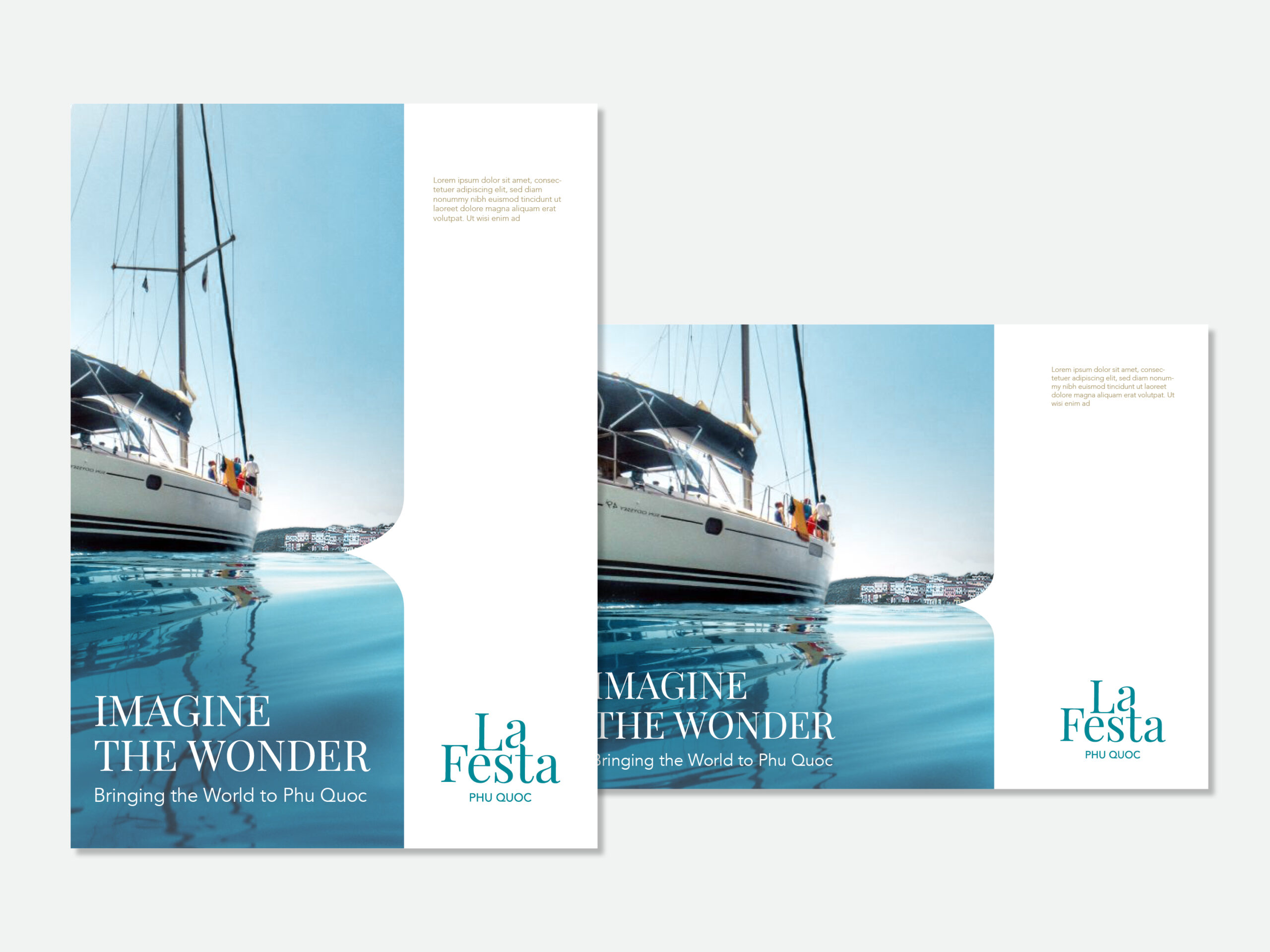
QUO needed to create a resort concept that fitted the Curio Collection by Hilton’s paradigm of unique, story-driven properties. We also had to marry these needs with the strategy and vision of the local developer and harmonise the resort with its context of Sun Premier Village Primavera.
Beginning with a stakeholder workshop to define the essence, QUO helped craft a fictional backstory that embedded key client goals, as well as a sense of desire and wonder that underpins the project. The resulting story of an artistic local couple’s journey to the Mediterranean was the fuel for a comprehensive brand build. From the core concept of “imagine the wonder” came fantastical elaborations of a memory of Mediterranean summers brought back to Phu Quoc for all to enjoy.