Baros Maldives is an undisputed legend. This luxurious island resort has been a beacon of Maldivian hospitality for more than four decades. In fact, Baros Maldives has been voted in 2020 as world’s Top Luxury Hotel by TripAdvisor, along with numerous other honours.
But how do you make the best even better? That was the challenge presented to QUO when the resort approached us with the task of encapsulating this rich heritage and unrivalled reputation in a new brand identity that also reflected its progressive spirit.
QUO worked closely with Baros to help refine its forward thinking vision in a way that stayed true to its past. The result is an evolution of the Baros brand that seamlessly blends its position as one of the Maldives’ original and best resorts with an enterprising, ever-evolving spirit.
Services
Brand strategy and culture
Visual identity
Tone of voice
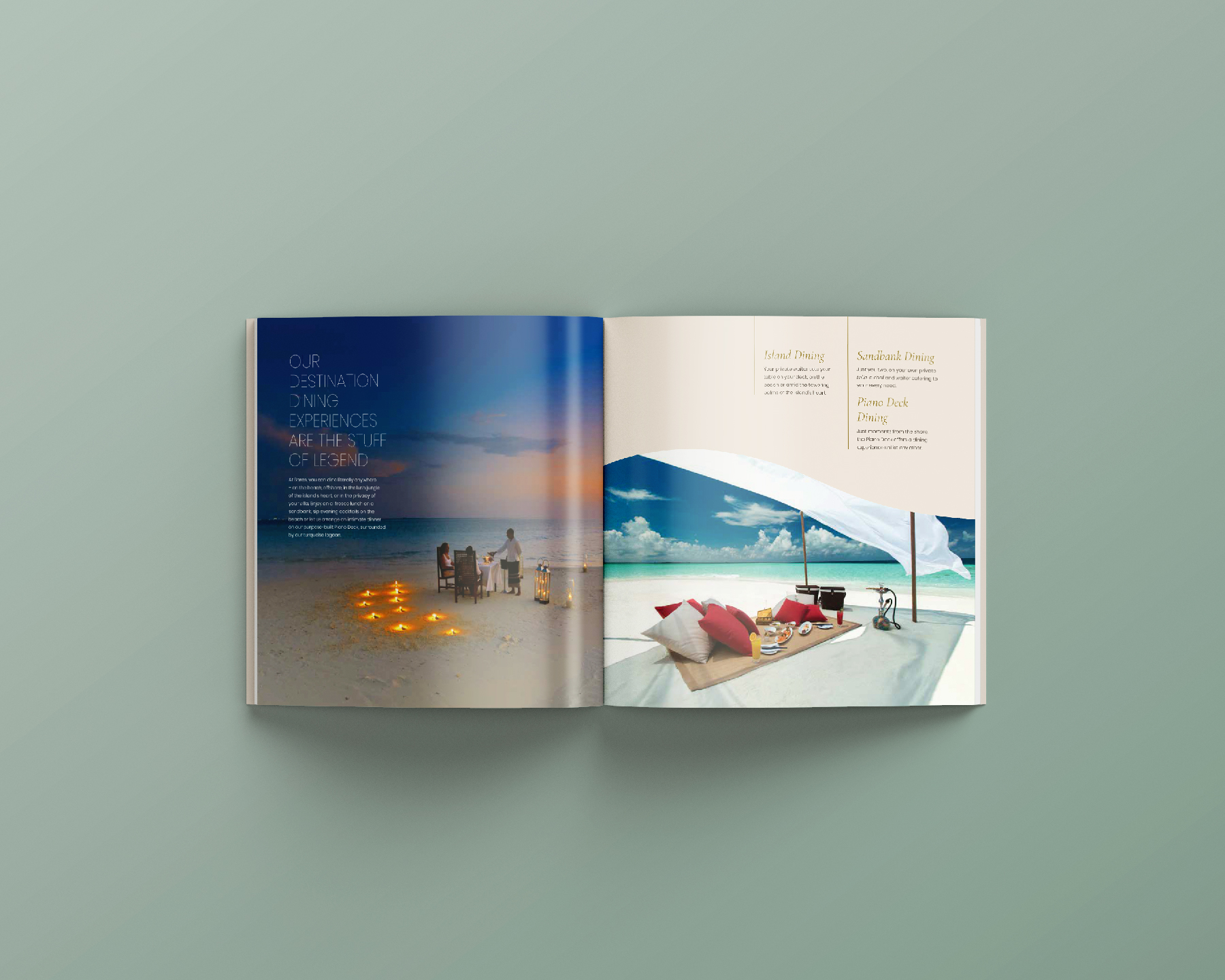
Guest experience
Applications
Website
‘How do you create a visual identity for a place so stunning it defies description?’
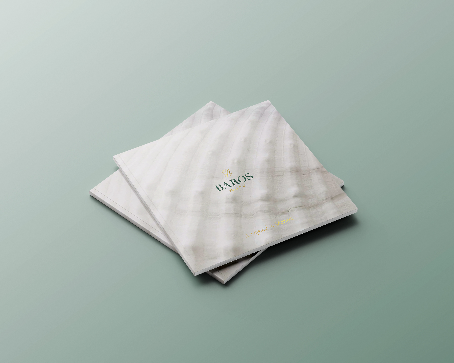
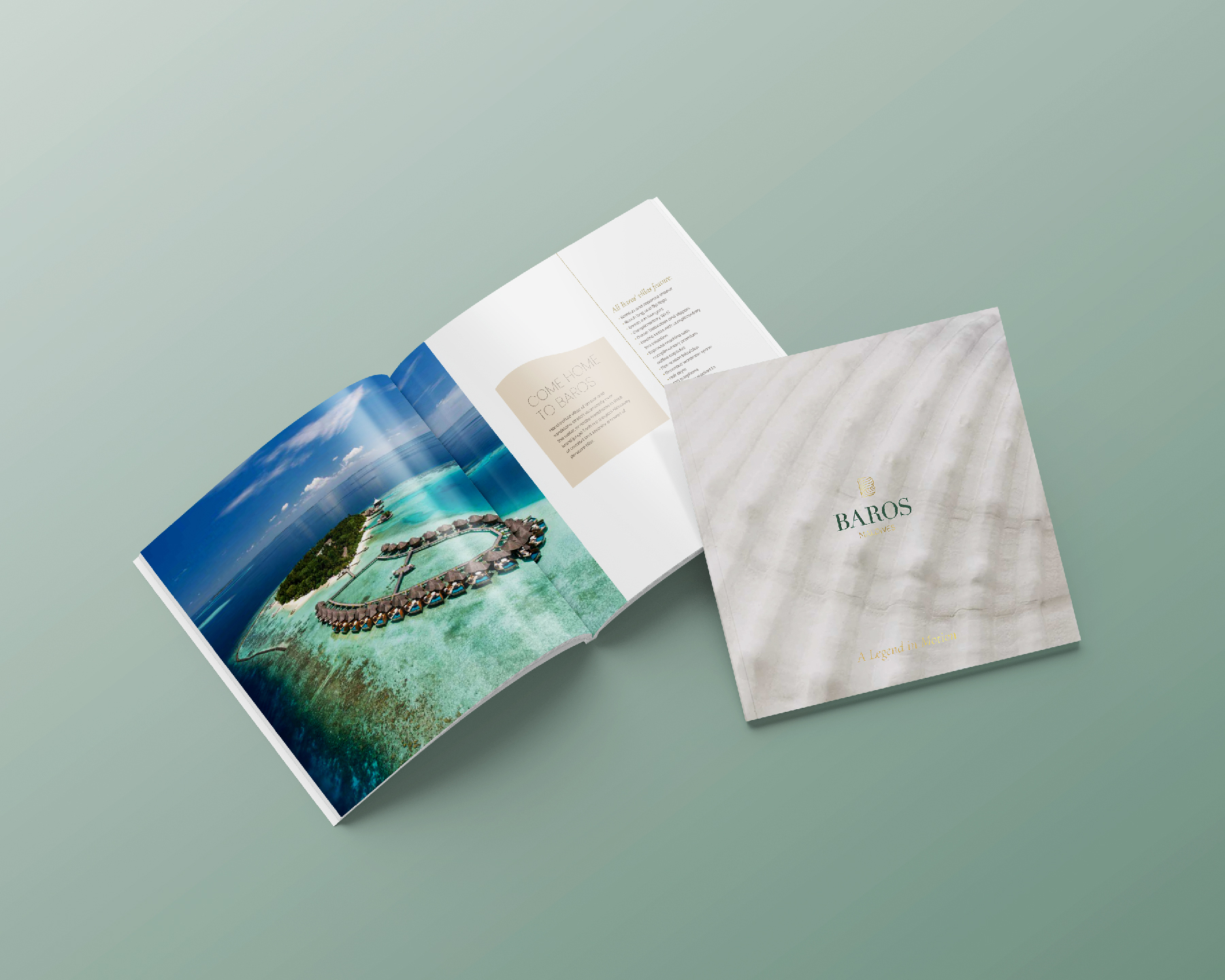
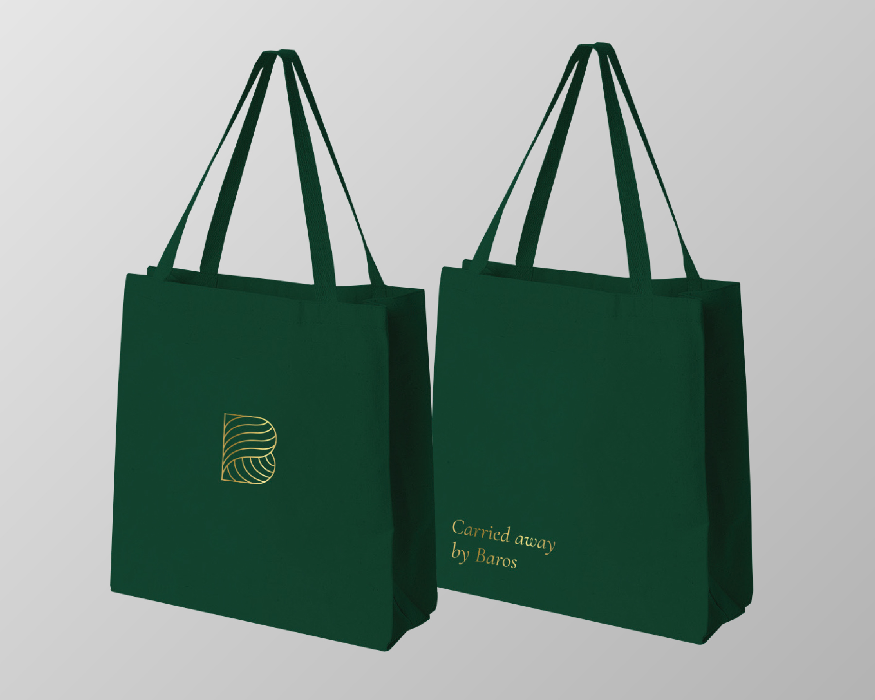
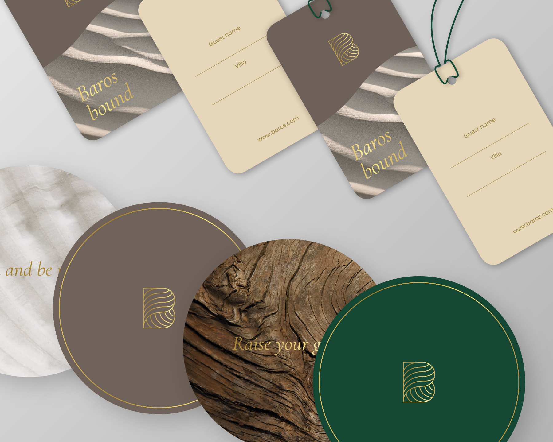
The answer was to give Baros’ beautiful natural scenery and elegant interiors plenty of room to breathe. Earthy greens and subtle browns communicate the hues of Baros’ natural palette, giving the brand a sophisticated, down-to-earth feel. A totally new logo with a prominent ‘B’ mark reflects Baros’ lasting legacy as a ‘statesman’ of Maldivian hospitality.
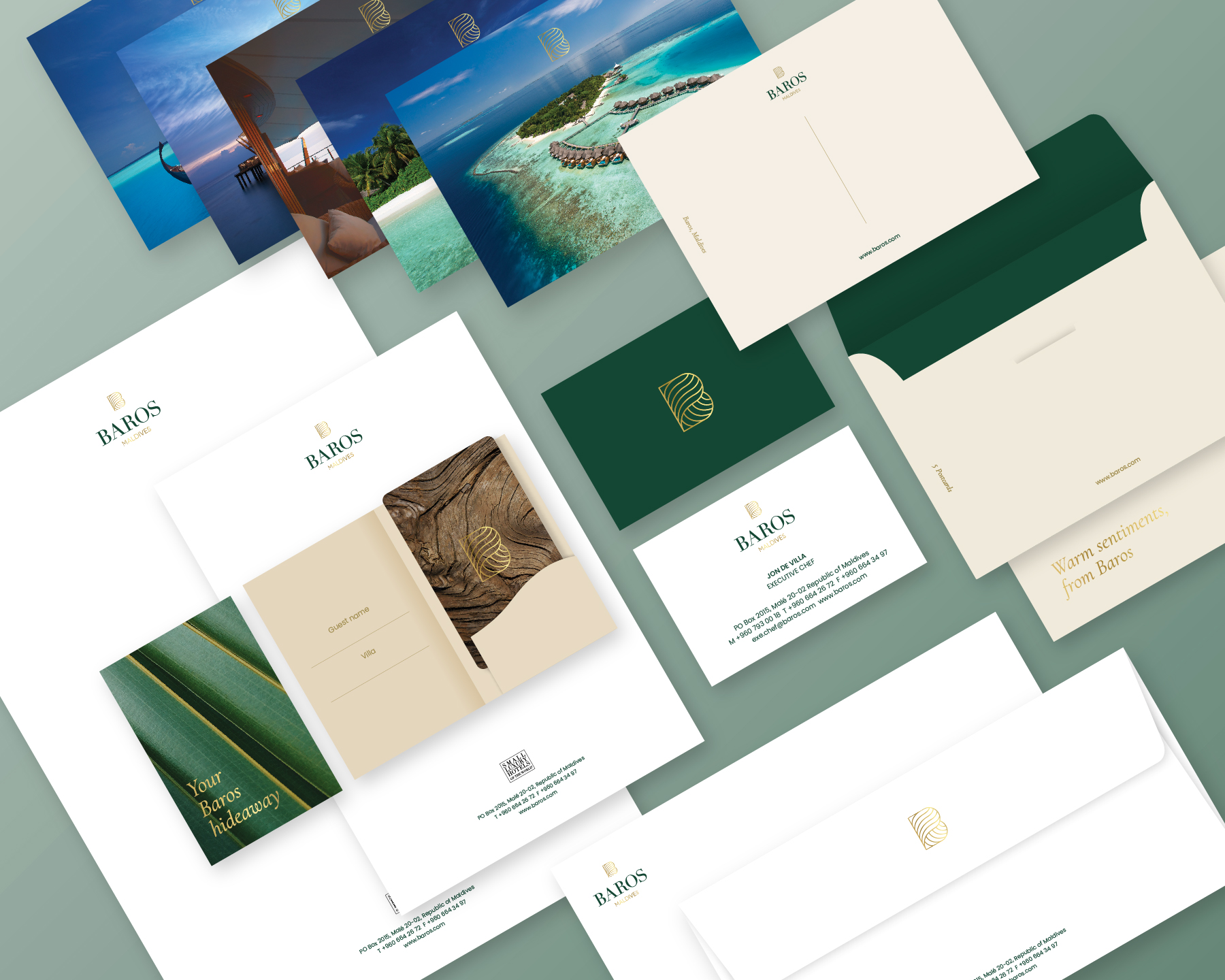
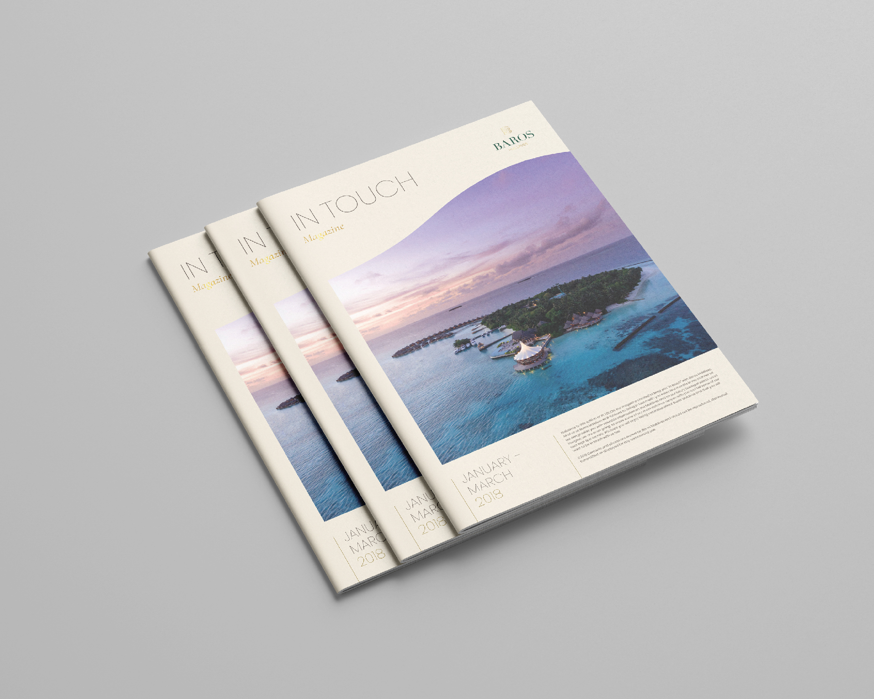
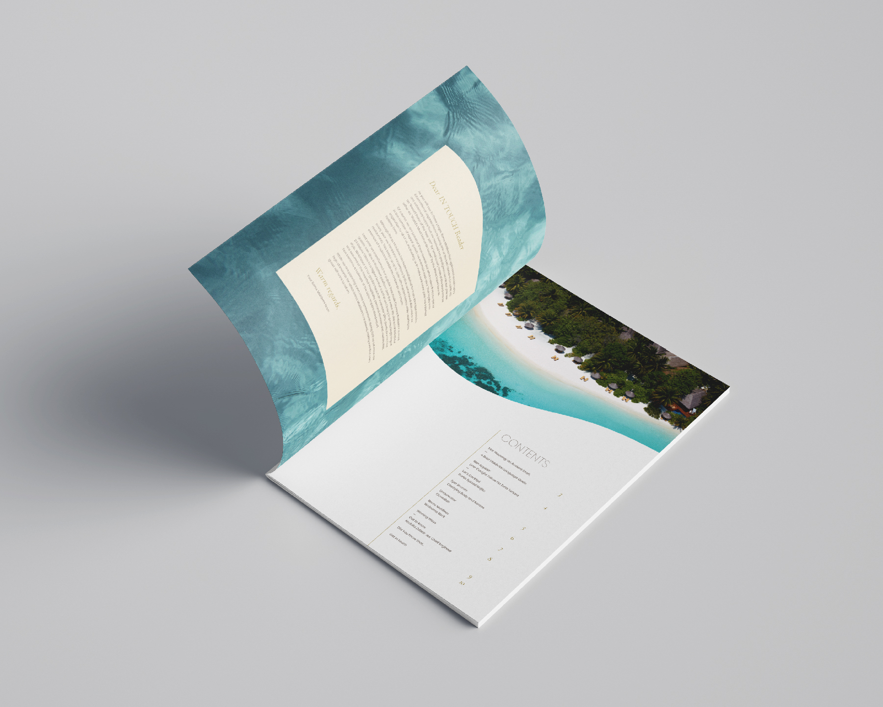
The resort had a lot of well-established collaterals, so naturally part of the Baros rebrand involved redesigning day-to-day operational items, including everything from name cards to flip-flops.
Despite its status as one of the world’s leading luxury resorts, Baros needed to stay relevant in a market where competitors have sleek, modern websites. QUO’s digital team combined stunning imagery with a user-friendly interface, interactive galleries, crucial resort information and a floating booking button.